BOUL’MICH 50th Anniversary


- CL/
- BOUL'MICH Co.,Ltd.
- CD/
- YUTA AKIYAMA
- D/
- MARINA FUJITA
We were in charge of logo design, package design,
and visual production for BOUL'MICH Co.,Ltd. to commemorate their 50th anniversary.
The logo was inspired by the iconic fountain in Place Saint-Michel, France,
where the company's name originates.
The motif at the bottom has two meanings:
a fountain full of new deliciousness, and a plate that delivers BOUL'MICH's special sweets.
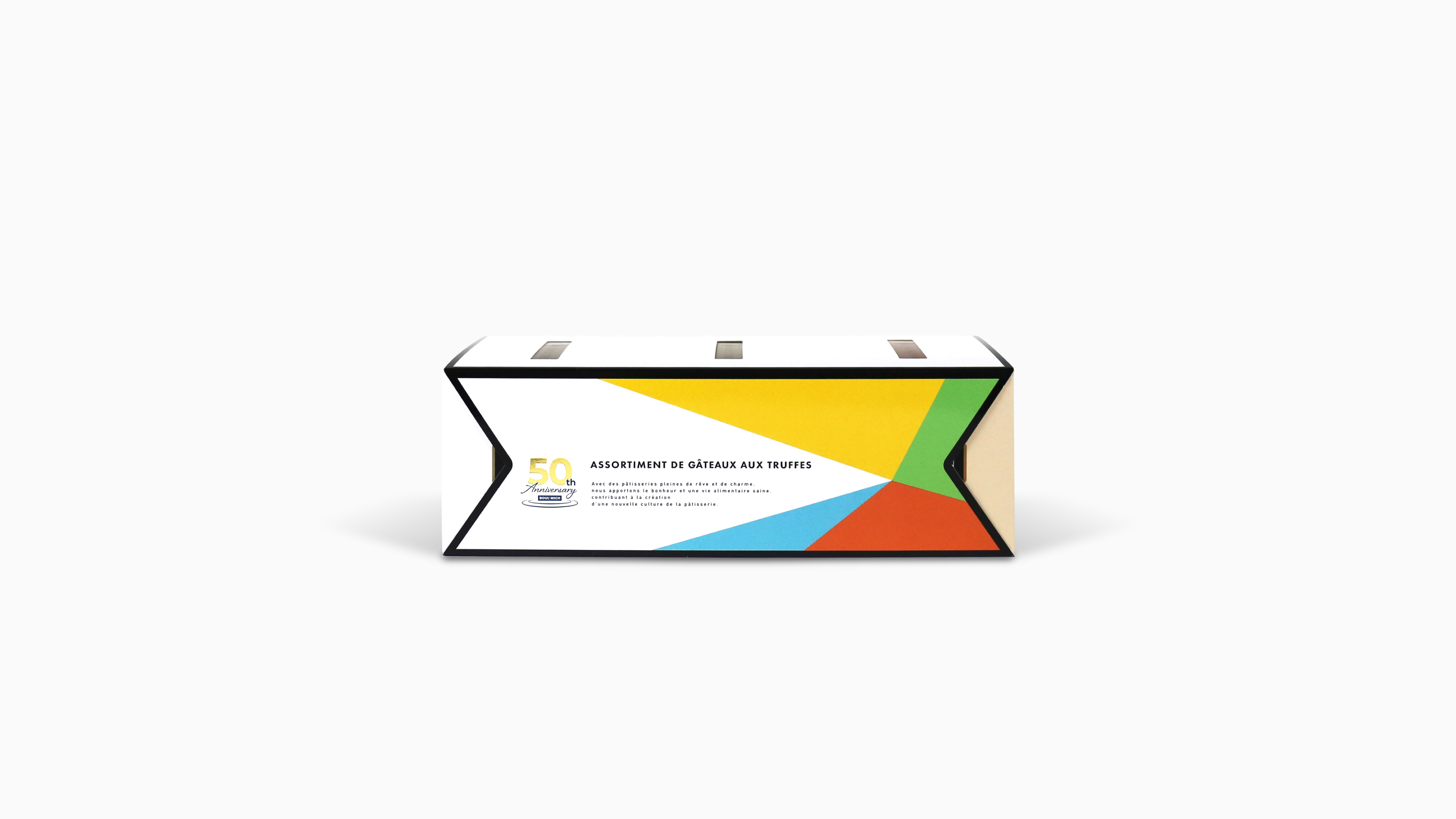
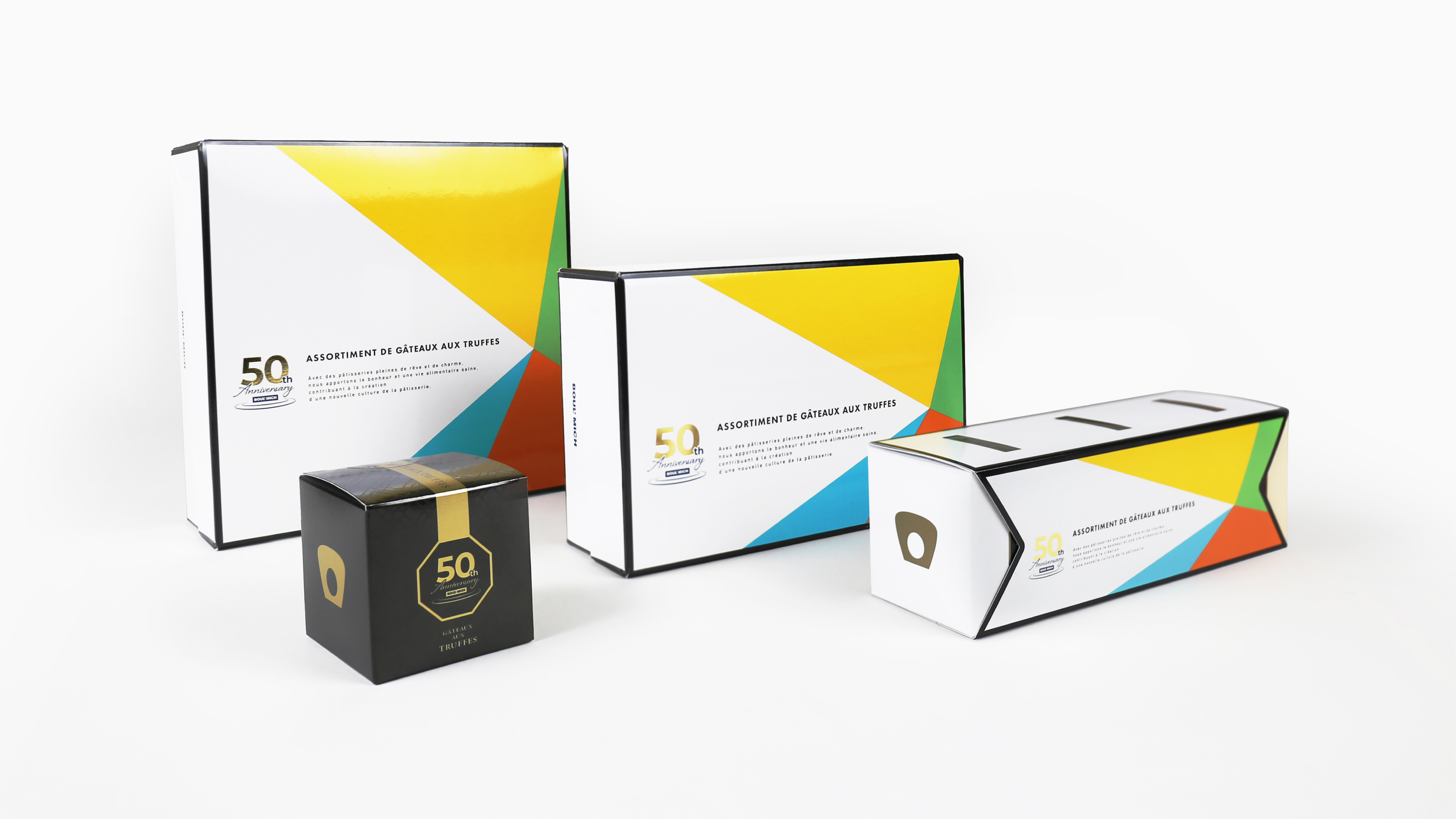
The package design is based on the concept of "dynamism toward the future"
and uses surfaces to express movement and depth.
It is composed of 5 colors inspired by the 5 keywords cherished by BOUL'MICH:
"gratitude," "contribution," "passion," "challenge," and "imagination."
In addition, since the 50th anniversary limited flavor of truffle cake is black truffle flavor,
black is used as the closing color to add a luxurious and special feel.